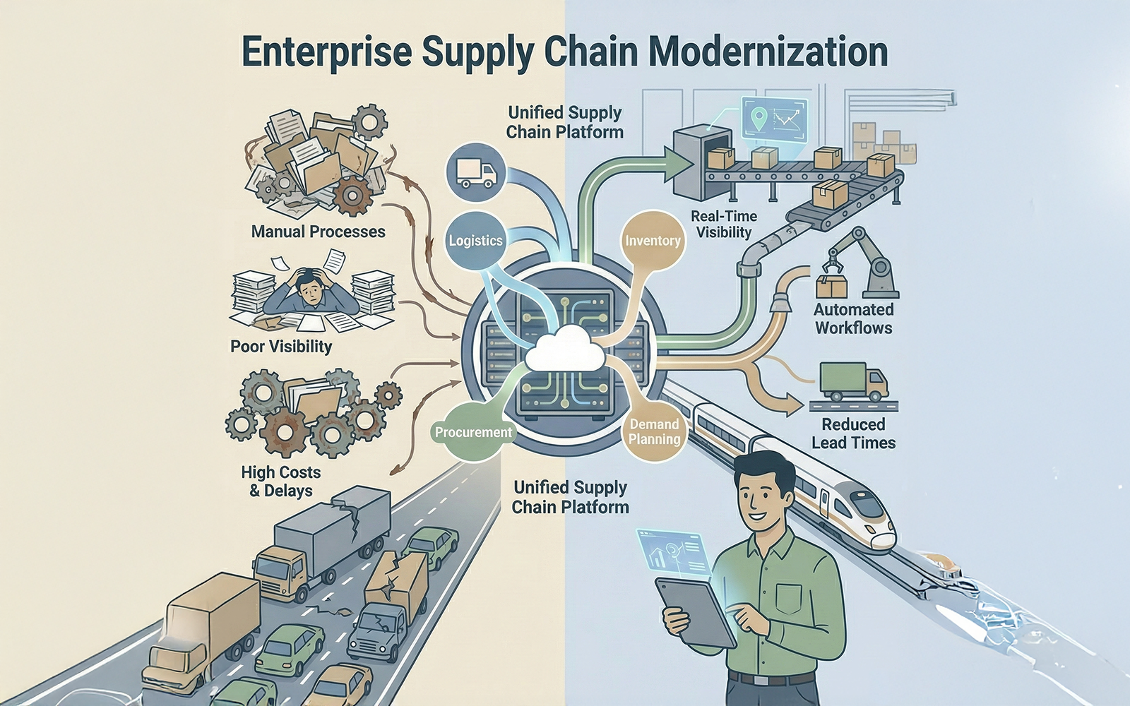
The Constraints
-
Workflow Complexity
Existing tools required 15+ clicks to perform routine status checks, leading to user fatigue.
-
Data Visibility
Critical shipment data was buried in tabular lists without visual hierarchy or alert systems.
-
High-Stress Environment
Operators work under time pressure; the UI needed to be high-contrast and error-forgiving.
The Approach
Dashboard Redesign
We moved from a table-first view to an exception-based dashboard. Operators now see "At Risk" shipments first, rather than a raw list of 1000s of items.
Visual Data
Implemented D3.js visualizations to show supply chain health at a glance. Color-coded status indicators allow for faster decision-making.
Simplified Actions
Reduced the "Click Depth" for common tasks (like rerouting a shipment) from 15 clicks to 3 clicks through smart context menus.
Mobile Parity
Enabled warehouse managers to approve exceptions via mobile/tablet, unblocking desktop-bound workflows.
The Outcome
Increase in daily active internal usage.
Reduction in training time for new operators.
Visibility achieved across 12 warehouse locations.